Episode Transcript
[00:00:01] Speaker A: Greetings, friends. It's great to see you all here this morning on this beautiful last day of summer, Full last day of summer day and Sunday.
What's that?
[00:00:12] Speaker B: Not picking up.
[00:00:12] Speaker A: I don't think you're not hearing me.
[00:00:15] Speaker B: There you go.
[00:00:17] Speaker A: Huh? How we doing with the. Do we need to have a.
[00:00:20] Speaker B: It's okay now.
[00:00:21] Speaker A: Volume adjustment.
[00:00:22] Speaker B: Okay.
[00:00:22] Speaker A: Oh, now we're there now. Hello. Well, once again, everyone, greeting on behalf of the Adult Education Committee. My name is Marshall McKnight. Welcome to this exciting day of reframing faith. This is the third day in our series here in September. The first, we kicked it off with Tom Coogan, who talked about the Grateful Dead. He's in the back getting coffee, so say hi to him right now. Wave to him. Hey, date. Hey, Tom.
Then that was followed by Ned Walthall talking about faith in photography. Today we're shifting to the sanctuary. Does anybody.
Has anybody noticed that there's new writing in the chancel?
Has anybody seen that? Yeah. And there's a new painting and it's really exciting. So today we're going to learn about the art and architecture of that. And I will introduce our presenters in just a few minutes. But first, pray. Please pray with me.
Creator God, you are the great artist. Thank you for making this beautiful world.
Thank you for artists who help us pay attention to your handiwork. Thank you for our speakers this morning.
I actually wrote Ned Walthall. I think this is my prayer from a couple of weeks ago. I'm so sorry.
Okay.
That's hilarious.
I'm going to wrap it up and say thank you and amen.
All right.
Wow. We're kicking it off. We're kicking it off so well. So let me introduce you to our guests today.
Carol Fegundis is a linguist and retired Princeton university librarian. A 40 year member of Nassau Church, she has served as elder, elder, deacon and in nearly every musical role, alto choir librarian, clarinetist, bellringer and director of children's bell choirs.
Kim Cleeson has been part of Nassau for 36 years, serving as both deacon and ruling elder. A flutist and choir member, she sees creativity as a spiritual pathway. Her study in spiritual direction at General Theological Seminary inspired the launch of Nassau's Art of Faithfulness Ministry.
Please give a warm welcome to Carol and Kim.
[00:03:02] Speaker B: Thank you for coming.
Is this picking me up this time?
I can't tell you how strange it feels to be here and not sitting in the choir loft at 9:15 on a Sunday morning because it's the literally been years since that has happened.
A little disclaimer I'm not an art historian, although I did do my research for this project.
I am a member of the Chancel Text working group that selected the new Bible verses and also worked with the artist to create the design.
The current design is one of several that the sanctuary has had over the years.
In the church's archives there are photos of the sanctuary dating back to the 1800s, and let's just look at a few.
1876. Pretty ornate with the organ up front.
In 1896, we have the apse that we're accustomed to and the organ has been shifted over to the side. But look at the really ornate frieze along the top of the wall and even on the ceiling itself.
These are some of the architectural details that are currently in the chancel.
And in 1950, things look a little more familiar, although there's a little bit more fixed furniture than we have now.
A 1970 rendering, I can't quite tell if that is a communion table in the front or whether that was another built in and something that looks more familiar. 2008 and here's the chancel as we knew it until the first quarter of 2025.
If you remember. A little over a year ago, the congregation received a message from Dave about the upcoming change in the Chancel Texts. Session had approved the new text for the chancel, and Dave asked the members of the Chancel Text working group to continue working together to work on a design and bring the project to completion.
Now, this is a congregation that appreciates art, art in many forms.
And rather than simply replace the text retaining the same design, we felt that this was an opportunity to bring an artistic eye to the texts and to the space.
I'm going to talk a bit about the process that we followed to come up with with the new design in the ats.
First, the group discussed how to find artists who might be appropriate for the project and identified several possible sources.
For example, Bill Wakefield spoke to people at the Arts Council of Princeton. I spoke to people in the university's office of the Architect about renovation projects that they had done.
And ultimately we ended up bringing in two artists with proposals.
The one we chose was Ruslana Makarenko of Ecclesiastical Art and Design.
This firm was founded by Ruslana's grandfather when he emigrated from Ukraine, and she and her three brothers all grew up in the business.
She also has degrees in art and architecture.
The working group did not have specific design requirements beyond making the text more legible and setting it in a design that fits the Greek Revival style of the sanctuary.
We also wanted the design to enhance the text and to incorporate more color.
And this is what we came up with.
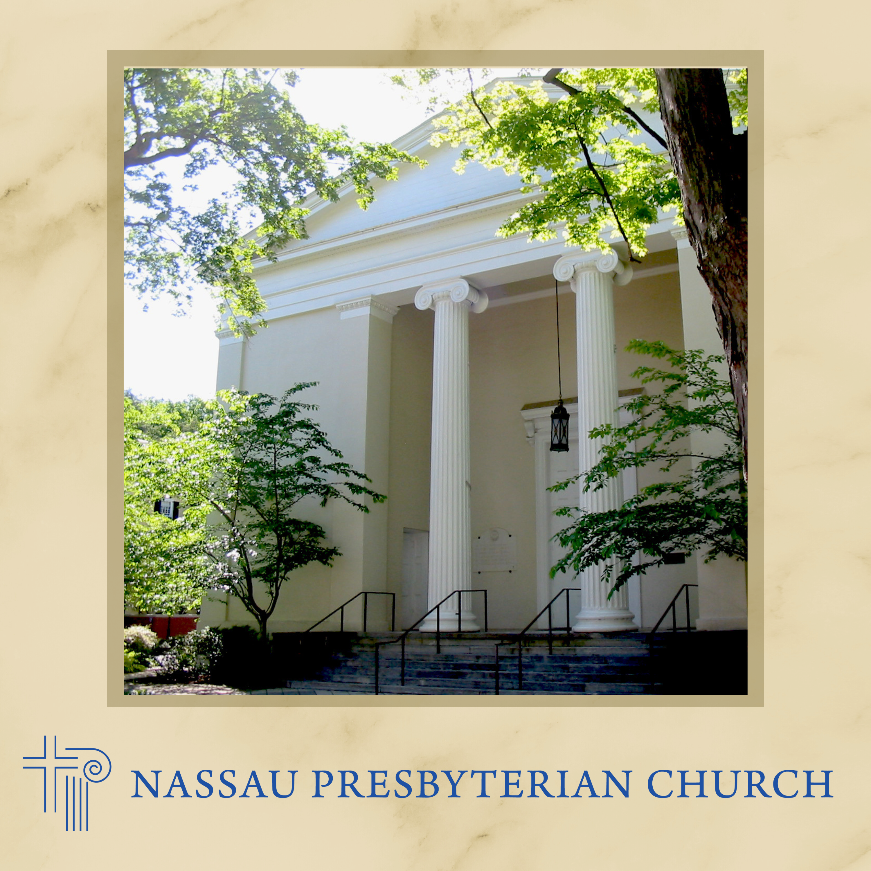
If you know anything about classical architecture, you know you're in a Greek Revival building before you even go through the door.
Notice the large columns with Ionic capitals, the pediment above the doors, a very classical design.
Many of you in the congregation, as I did, may have thought of the design of sanctuary as being quite simple, but that was largely due to the fact that the woodwork and trim in the chancel were the same color as the walls, so they didn't stand out. In fact, there are several classical motifs in the architecture of of the sanctuary.
One that you'll see a lot is a design called an anthemion or palmette. This design dates back to ancient Egypt and was used in a lot of Greek and Roman classical architecture.
And here you can see in these architectural details from the chancellor.
The one on the top is the screen that's above the frieze in the sanctuary. The one in the middle is the pediment on the two doors that come out at this end of the sanctuary that that fan like anthemion design is there again, columns with Ionic capitals. In the chancel, we have an egg and dart trim that you may never have noticed. I certainly never did. But it's all around the proscenium arch at the front of the chancel, and of course, the Greek key design in the stained glass windows. All of these are elements of neoclassical neo Greek design.
So the group depended on the artist to supply her artistic vision to bring both the text and these architectural elements into a unity that emphasized both of them.
So the first thing that Ruslana did was to stream a service because she wanted to see how the space was used by the congregation on any given Sunday when she came to visit the church. One thing she noticed that probably few of us realized was that all the curvilinear elements in the room did not give the eye a space to rest.
The curved lines of the balcony led the eye to the curve of the chancel and back to the curve of the balcony on the other side.
The lack of contrast between the text and the wall of the chancel did not give your eyes a place to focus.
Ruslana made three points about designing for the space.
First, the text had to be easy to read and needed to be the focal point.
Second, she introduced ornamentation in the Greek Revival style to match the architecture and help focus on the new texts.
And third, she picked up the colors of the stained glass, which also informed the color of the pew cushions, incidentally, and used those colors in the chancel, the design she created, not only forces your attention on the chancel, but it invites you to reflect on different parts of the design.
As you move to different parts of the room, different elements of the text and design become more prominent, inviting meditation.
Changes in where you're standing, changes in lighting.
Any change of the angle that you're at, you see something different.
Now, for the following photos, I just want to say that these were all taken at different times and in different lighting conditions. And Nick and Noel have been working with Spinnaker, even up till Friday, to improve the lighting so that everything is seen at its best.
And I think when you go into the sanctuary today, you'll see, especially if you sit near the back, that the texts are more legible than they have been the last few weeks.
They've kind of reduced the glow of the gold to make the letters more easily seen.
Unfortunately, I just found out about this Friday night, and I didn't have time to go back and take all new pictures.
So that's what we were accustomed to.
And this is the new text style.
Originally, the letters were much smaller, closer together.
They were unevenly spaced. Some of them were in italics, and they were all, of course, on a pale yellow background, which did not provide much contrast. And as somebody who's been sitting in the choir loft for four years, I can tell you illegible.
The new texts are in a consistent font, they're evenly spaced, and they're all uppercase.
Each letter is outlined in another color and rests on a background that provides much more contrast.
Texts are legible from the back of the room, I can assure you.
The initial letters in the text are outlined in blue, and the rest of the text is outlined in red.
You will see that when you go in the studio morning, particularly the ones outlined in blue.
But here's an example. I'm not quite sure whether you can see on the projection the red outline around the gold leaf. Actually, it's not an outline. Each letter was painted in the color, and then the gold leaf was applied on top of the painted letter.
The paint is a velvety matte so that it contrasts with the reflectivity of the gold leaf.
Just to talk about the use of gold leaf, gold leaf in ecclesiastical art symbolizes the divine light.
Now, in the Orthodox tradition that Ruslana grew up in, you would see icons, and icons are not meant to be representational art. They're meant to be a point of focus for your devotions and your meditation.
And, of course, we have no icons, we have no statues. What we have is the open Bible on the pulpit, the Word of God as our point of meditation, and now considerably more easily seen texts in the chancel as a point of meditation. And we'll get back to that a little later.
Regardless of the lighting of the room, gold never renders dark.
But to be most visible, it needs more contrast with the background than we previously had.
The text is done in 22 karat gold, except for the initial letters, which are done in 23 karat gold, which is ever so slightly redder than the 22 karat. So the initial letters, slightly different color, outlined in blue.
The outline color.
Nevermind.
Just said that the paint used for the background is very flat with no sheen.
The outlines of the letters are seen more in low light.
When the gold is not shining, the gold is seen more in better light. Either way, you never lose the text.
This slide was not chosen for legible text. This slide was chosen for being able to see the architectural elements on the chancel.
There were no lights on in the room when this was taken, except a couple lights in the apse.
So you can see how different things look.
But notice the dental molding along the frieze and the screenshot, which used to be all white, are done in different colors.
When we were first presented with Ruslana's design, we thought it was quite elaborate. As you can see on this poster, this is actually not quite the original design.
The original design had much more on the two outer panels.
And I think some of us were a bit taken aback when we first saw it, because most of us thought of the straight lines of the stained glass windows, I think.
And Ruslana looked up at the frieze and saw the anthemion and those vining elements, and those are what she took to help decorate the panels.
This is a side panel design as it ended up.
And notice in the center there is kind of a modified fan design that points in toward the text throughout the design.
Ruslana introduced ornamentation in the Greek Revival style that matches the architecture and helps focus the eye on the text. And she also picked up the colors of the stained glass and used those colors in the chancel.
A little hard to see on this slide, maybe a little easier to see on the poster how she used that anthemion or fan like design at the top and bottom of each panel.
So both that anthemion and the vines, as I said, come from those screens at the top of the frieze, and those architectural elements from the frieze are repeated on the pediment over the doors. How many of you noticed that those had been Replaced.
They were actually damaged and needed some repair, but they're back where they belong.
So the yellows, tans, and blues of the design are all taken from the stained glass. And I say blues.
Notice in the window that there's not just one blue.
You know, stained glass, you know, never has flat colors.
There's always variety.
And I think of the windows as being yellow and blue, but there's actually a good bit of tan in there as well. Again, always depending on the time of day and the lighting that's coming in.
But on the two side panels, those are rendered in the browns and tans that you see in the windows, all of the paint.
And if you look at the side of the poster there, you'll see that she used several different colors. Everything was mixed on site, and what that means is that everything was created several blues, several tans, several gold, several yellows, and put up as samples to see what worked best in different lighting conditions.
So she calls it a teal that she chose for the background on the panels.
And that color is second only to the gold leaf in grabbing your attention.
There are also multiple colors used on the architectural elements. And this. You really need to go up to the chancel and look up. It's an amazing paint job. She's done. Done something that might look basically off white from the back, is in three different colors, where darker colors emphasize the shape of the architectural details.
So my reaction to the design, as I said, I was quite surprised, if not overwhelmed.
But the more I thought. Thought about the design, and the more I examined it, I felt that it was creating a link back to the Nassau. Well, the First Presbyterian church congregation of 1836, when this building was built. This is the third building of this congregation in this town.
It was not colonial building.
It was much closer to the Civil War than the Revolutionary War.
And they chose this Greek Revival design.
And I feel this chancel design celebrates that choice.
There's been a great cloud of witnesses in this geographical site since 1756.
And as Dave says, what is in the center of campus, in the heart of town, and I feel that we are celebrating that length of service.
[00:22:06] Speaker C: Overall.
[00:22:07] Speaker B: I think it's a dynamic piece of artwork that glorifies God and gives us a focus for meditation on the texts.
This was a very important finding for the Chancellor Tech's group and I hope for the congregation.
Because of the medium of gold leaf, different text comes to the foreground or moves to the background, depending on the lighting. Where you sit, what time of day it is, invites us to exploration and Discovery and to leave the pew and move about in the sanctuary.
And to finish, I just want to give you one sample of what I call unexpected grace.
This photo was taken back in July before we came back to worship here.
And it was just in the lighting that happened to be in the room at the time.
I was quite pleased by the photo when I looked at it.
I ask you, what grabs your attention about it?
Do justice, love, kindness. And that's exactly what I saw.
And I said, oh, okay, this is me interacting with this design, and this is giving me a point for meditation. And what does it mean on that day, in that space at that time, to do justice and to love, kindness.
Okay, so that's the end of my part of this presentation. Do we have any questions or comments?
Yeah, Dave, right there.
[00:23:54] Speaker A: I'll be right there.
[00:23:54] Speaker B: Dave, hold on.
[00:23:55] Speaker A: Thank you.
[00:23:57] Speaker B: Go back two slides.
No, the one of the whole chancel. You had said something about looking at the ceiling of the Chance and see different colors. Can you point on that where you mean?
Actually, Sorry. Anything that's painted, the screens.
These screens, the dental molding, you have to look up close.
You've got.
There is darker shading on the columns. In the fluting of the columns, there's darker color on the egg and dart trim, but particularly the frieze and the screen and the dental molding is where I noticed it. But you have to be up close and personal.
Beth.
[00:24:53] Speaker C: Thank you.
[00:24:54] Speaker B: How many.
What was the size of the team?
Did the artists do some of the physical painting?
[00:25:02] Speaker C: Herself?
[00:25:04] Speaker B: Yeah, the artist did probably most of the painting. Her husband was there as well, working on it. And near the end, one of her brothers came to help finish it up.
And I believe they made basically, like, stencils to get the design onto the wall to guide them through the paint painting. And in some of the pictures that we're showing in the other slide, as you walked in the door, you can see Dorian kind of laying on his side and painting. And you can see Ruslana up on the scaffolding.
[00:25:44] Speaker D: Keith, I just want to say the whole thing is built up. So as you said, the outline of the colors is actually the letter painted and then the gold leaf laid on top of it. So the whole thing was built up from the base colors that you see in the planar panels, through the blue, through the colored outline, and then finally the gold leaf. It's really an amazing process that they went through.
[00:26:11] Speaker B: Yeah.
Okay, Kim.
[00:26:16] Speaker C: Okay, great. Thanks, Carol.
You can leave maybe the whole front side. The last one up would be great.
[00:26:26] Speaker B: I'll find it eventually.
[00:26:27] Speaker C: Yeah, that's fine. So.
So I just want to. Before I shift us in, how we're thinking, I think, in the room. Well, I know Claire and Keith were also part of the group with Carol. I. I don't think anyone else from the group is in the room. So I just wanted to acknowledge them in the room as having worked on this also.
So I'm going to shift our gears a little bit from the knowledge about our sanctuary, the architecture, how painting came to be.
So that's a lot of the mind. Right?
I'm just going to shift us to thinking about how we also can approach the sanctuary with our heart. Carol used the word a number of times, meditation, and how this sanctuary has caused her to meditate in a different way than before.
So that's the shift I'm going to make for us. And you probably all heard us talking about the last few years, our art of faithfulness work.
And that's where we've really invited everyone through small groups or. Or larger activities to approach art as a pathway to being closer to God, deepening your faith. I think you all have an experience where you've been deeply moved by a piece of art or listening to music or something else. So we've been doing a lot of work around that very intentionally. And certainly this work in our sanctuary, when I began to see how it was unfolding, to me it was a natural to say, how can we approach our sanctuary from a meditative or contemplative point of view? Not just once, but maybe like ongoing, as you enter the sanctuary multiple times, as Carol said, in different light, in different times of the day, in different mindsets that you might bring to it.
But that also requires you to put aside your more objectified responses. Right? So if you have the response of, oh, I really love this about it, or I really wish they hadn't changed that, or I really don't like this part of it.
Approaching something in a meditative or contemplative way asks you to put all that aside. It's hard to do. We're pretty trained to be evaluative or objective about art and when we look at things.
But, you know, it's a practice to put things aside and then to really take in the beauty and reflect on that relative to your faith. And I would argue, and I think I would imagine all of you, but certainly, certainly most of you would agree that in the times that we're in today, in our country and in our world, we need beauty more than ever.
Beauty not just for beauty's sake, but beauty that reminds us of the good in life, the good in our neighbor, the good in our communities, and the good in ourselves.
So let me give you some further background. About one and a half years ago, Noel Warner and I attended the Calvin Institute for Worship, which is up in Grand Rapids, Michigan. And there we came upon a workshop done by Alyssa Weichbrot.
She's a professor in a Southern University Christian who. I can't remember which one now, but she's done a lot of work on looking and learning from art, not from an objectified or a headspace, but from a Christian heart space.
And what she had to say resonated deeply with Noel and I about what we've been working on here through Art of Faithfulness. So it both supported that work, but it also challenged us in some new ways to think about how to bring our work to the congregation. That combined with this work, and as we move through it, it became super clear to me that a devotional guide to Experiencing the sanctuary in its entirety. And I call our sanctuary Art Filled, not just the front, but as Carol has said, all the places where the chancel echoes the architecture of the space.
So experiencing that sanctuary from a devotional standpoint in a very intentional way. I'm sure many of you do that in preparation for worship, but this maybe takes that to a deeper level.
So, coincidentally, at the same time, the group you'll hear from next week was developing devotional guides for. For the text.
So we now have two devotional guides. So you'll hear about that next week, but the devotional guide for Encountering the Art and Architecture of the Sanctuary. And are you going to hand it out? Okay, great.
The quote that I put on the front says, the real voyage of discovery consists not in seeking new landscapes, but in having new eyes.
So this is an opportunity to put new eyes as you look into the sanctuary.
I'm going to just take you briefly through this so that you have a sense of how to either use this guide or maybe just on your own approach your time in the sanctuary from this meditative and contemplative point of view, because I don't often like to read to groups because I'm like, well, you can read it yourself. But I would like to read the introduction mainly because I wrote it and I would just be saying it anyway. So let me just read it because it summarizes where we're coming from. So I first referenced the book that I showed you, Redeeming A Christian Guide to Looking at and Learning from Art.
So Alyssa puts forth her belief that God delights both in art and artists.
It's not just the creator of art or the maker of art that's the artist. And this is like a tough one to get through because we all agree that those who create art are artists.
And we often fall into a trap of thinking of the artists as they and me as not an artist, right? So the artists are them and then there's me.
But she also believes that we're all creators, as I do, and that that's modeled after God's creation. I mean, God created us in God's image. So if God's a creator pretty simplistically, then that would point to us as also being creative creators.
So that creation, and she would argue of making and seeing and experiencing and engaging with art forms is also creation. Because every time you engage with art, art comes alive, it's different and a new meaning comes out of that.
So if you think about it, art, if it's not looked at or listened to, it rests in isolation and really, one could argue, doesn't really exist until someone engages with it.
So as Christians, we all have this ability, individually and collectively, to engage with art, bring our own experiences, our faith, our spirituality, and our growth to keep it alive and generative.
Also supporting this work is an angel contemplative practice called visio divina. And that's literally divine seeing. And Noel and I have used that practice in some of our small groups along with musica divina and lectio divina. It's a way of praying through looking at art or listening to art. And it really invites you to not just take a quick look at the art, but to sit with art or sit with the listening for 10 minutes, maybe 15. It's really hard to do when you first try that.
And that would be also what Elizabeth would challenge everybody to do is to really sit with the art, suspend your judgment or suspend your evaluative thought thoughts and take in all that you're seeing.
So it's our hope that through this guide and through the wonderful opportunity that we have with our sanctuary, that you will take advantage of experiencing our art filled sanctuary through a devotional or contemplative meditative way.
So I'm going to just summarize how you might go about doing that. So I've laid that out for you in the middle pages.
But certainly there are other ways to do that. And if you find other ways that work for you, by all means engage in a way that works for you to find deeper meaning in the Art and to let it bring you closer to God and deepen your faith.
But a suggested way to do this is to really find a time when you have maybe 10 minutes, but maybe even a little more, maybe 15 or 20, when you can go into the sanctuary, maybe before worship, but sometime when there's not a whole lot of stuff going on, and get yourself in the middle of the room and just start and slowly turn yourself around and stop and notice what you're seeing as you're pointed. And you might. You can start anywhere and end anywhere. But just notice, you know, you don't have to, like, do anything with it, but just what pops out for you, what grabs your attention?
What do you notice in the light? Carol talked a lot about how the light in the sanctuary highlights different things.
What about the color? The whole sanctuary has been painted that makes it really different.
There's painting, as Carol described up in the chancel, that you have to get close to, but it's not just flat paint anymore, which makes that come alive in a very different way.
So do that and just take it in, right?
And listen for what speaks to you and what speaks to your faith.
And then as you kind of go through that, then kind of freeform it. Where's your favorite place in the sanctuary?
Where do you usually sit?
Where do you wish you could sit, but someone else has that situation?
Where have you never sat that you'd like to give a try out to and go to one of those spots and do the same thing. Either stand up or sit down and look around and see what grabs your attention, what's different?
What do you notice that's the same? What do you notice that touches your heart or your mind in a different way?
And you might want to also walk up close to the chancel. We've talked about that. Keith highlighted that. Carol's highlighted that. The only thing we would ask you is don't touch it, because oils from our hand, if we touch paint and gold leaf, it will start to affect those things. But you might want to walk up into the chancellor and look up, look around and really taking it in, and then reflect on that. So after you've spent some time just looking and taking it in, some questions that you might want to consider. There are only some. They're the ones I put out there, but you might have some that pop up for you.
How does the beauty of the chancel touch your faith?
How can responding to our entire sanctuary help us live into the text and the mission of Nassau Presbyterian Church?
We see and experience the sanctuary regularly. So it's new now, but over time, as we get used to it, how can we keep it fresh and alive?
And how does it continue to transform you?
So as you see it, in different ways and in different part seasons of the liturgical year, perhaps with different messages from the Word in the pulpit, how does that transform you, and how does that maybe change what you're experiencing in the art and architecture of the space?
And how might that therefore then continue to evolve and transform our community of faith?
And then, you know, you might close by offering a prayer to God. So this is a suggested way, one way to experience our sanctuary, taking all of the wonderful information that Carol's given us and looking at this through new eyes.
So I hope that's helpful. And I will pause now, and it will, for either one of us, an opportunity for questions, questions or comments.
Yeah. LARRY.
[00:40:49] Speaker E: So a question. Does the Greek architecture, Greek Revival architecture itself, lead to special meditation where the architects, original architects as well, is the people involved in this process thinking about how that particular mode of architectural speaking should be speaking to us?
[00:41:16] Speaker C: I just want to clarify. You're talking about, like the Greeks of long ago or the artists that did.
[00:41:20] Speaker E: Our work well, the arch.
Why was Greek Revival architecture chosen amongst all the different points?
[00:41:30] Speaker C: Can you answer that?
[00:41:31] Speaker B: CAROL well, I'd say we didn't choose the Greek Revival.
They chose it in 1836.
Do we know why?
I don't know whether anyone's done research that far back, but I think from what I've read at the time, it was very I mean, it was used quite a bit for monumental, stately, important things.
But I haven't done research that far.
[00:42:02] Speaker C: Back to get to another part of your question about and I think I heard this right, Larry, does that style lend itself to meditation or particular style?
And so I'm going to say yes and no. So you heard Carol reference the artist. She comes from Ukrainian Orthodox tradition, Eastern Orthodox also use iconography, and iconography is often used in contemplative and meditative practices, however, and you can certainly do that. It's just not that's not how we as Presbyterians are wired. Right.
But it's an interesting thing to experiment with if you want to try that. But I would argue that almost any art you can approach, if you take time to experience it and set aside sort of your more objectified responses to it, almost any art you can use to meditate on and to seek deeper meaning with. And this is one of her arguments also.
So throughout and if you're really interested, I would recommend this book. She is very practical. She has a process, but she is filled with art. And it's not all Christian art. Some of it is regular non Christian art that she uses in her process of looking at and growing faith and really engaging in a different way with art.
[00:43:42] Speaker B: I would also say I grew up in a church very similar to this, and there is a certain gravitas to this kind of architecture. And we're down here, God is up there.
And there is a difference between us and we are worshipping God. And that's how I grew up, certainly in the 1950s.
Very different feeling from many churches being built today.
[00:44:12] Speaker F: About the exterior of the church. The design of the church was by an architect named Thomas Ustick Walter.
And he has an identical church in Westchester that was built two years before ours. And he sold the exterior plans to Stedman, who then built the church. That exterior, which is spot on Nassau or First Presbyterian.
And then Steadman did the inside.
The other interesting. Well, there's several other interesting points, but once upon a time there was a grocery store in Princeton that had a very large counter.
And that counter then became the part of the sanctuary at the pulpit level. It was across the front of the church and the little reading stand in the center. It then moved to down where the communion table is now.
And now.
And not quite as deep. It's in the narthex.
And the other thing dealing with the art is. We haven't mentioned Joy Saville's textile art that we use and may not know that her art is also in another church or synagogue on Nassau street that was commissioned to do work there.
[00:46:00] Speaker C: Thank you for bringing that up. And that's certainly a piece to look at and pay attention to if you engage in this process. I know you've had your hand up.
[00:46:13] Speaker A: Hold on.
[00:46:23] Speaker G: I've been told that there was a political element in the choice of the Greek Revival architecture, that part of the reason for the popularity of that style of architecture in the early 19th century was that the founders of our republic were looking back to the ancient Greek Republic and thinking of themselves as carrying that idea on into the present day.
And that that was one of the reasons why not just NASA, but so many other especially sort of monumental types of buildings are in the Greek.
In the Greek Revival style.
[00:47:10] Speaker C: Thank.
[00:47:13] Speaker B: You.
[00:47:14] Speaker C: And I think you can see there is also this interplay, knowing some of this information. That information could cause you to reflect about that as a theme when you're in the sanctuary. Your mind might go to that as a reflection.
As an example.
[00:47:43] Speaker H: For me the scriptures have so much content.
And for times like these, I see it as an honor to be part of an initiative to put that at the front.
And the color, the lighting, all of that is an interplay.
[00:48:06] Speaker B: And.
[00:48:08] Speaker H: The way I look at it is when you come in, the light may be different at one time and it may just highlight a word or a phrase.
And I take that in faith, the Holy Spirit is prompting thought, thought, thought, as well as vision and ideas, and prompting intercession for the context of that word. Because there's much, I'm sure, on God's heart in these days. And we've chosen primarily the walk of love, which is a good thing.
Just a comment.
[00:48:51] Speaker C: Great. Thank you, Patricia.
And that's actually a good tee up to say. And come back next week when the focus will be on the text.
[00:49:03] Speaker A: That's right. Thank you. Let's give a big hand to Carol and Kim.
As Kim said, we'll be wrapping up next week with the new biblical texts. We will have Eric Barreto, Andrew Scales and Carol Wareheim here. We hope you'll join us. Thanks, everybody.